Completing Into to Art
Art80 at Irvine Valley College is now under my belt. It was both painful and eye opening to me which is what I expect out of any learning experience. I certainly feel that I am a better artist for having taken the class, mostly due to looking back at my work from the beginning of the semester. If you ever plan on taking an art course, or plan to embark on any sort of learning endeavor, I implore you to record and timestamp your progress. It has been invaluable to me for the purposes of proving to myself that I was getting better (though, you are the final judge of that!) Seeing the progress by date is immensely helpful in persevering through an otherwise difficult period. Without further ado, let’s critique my work.

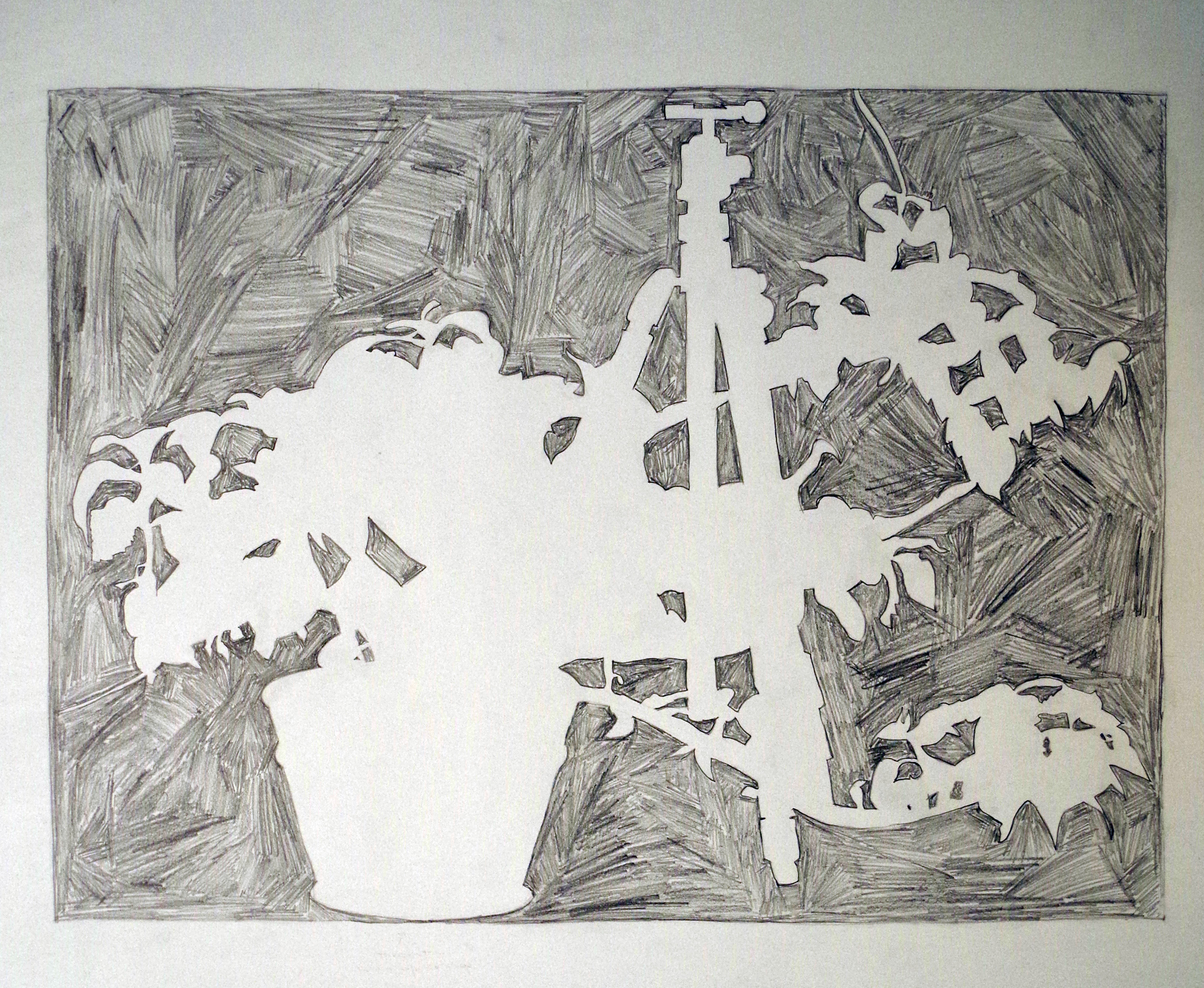
This is a view of my apartment. The assignment was to draw a one dimensional representation of some scene. I choose to represent my apartment, because it would not change in lighting or layout, making it easier to not chase a moving target. Due to time constraints, I was unable to add an “organic” element to the drawing which would have enhanced the piece. That aside, some things worth noting:
- All of this is in one point perspective. What does that mean exactly? There is exactly one point where all lines converge to. You’ll notice it directly above the fireplace. This was rather difficult, because the plane in which the fireplace sits is actually not part of the perspective. That wall is sighted (drawn by me measuring with my pencil and squinting) with the other elements in the scene. All other lines are strictly vertical, horizontal, or aimed at the vanishing point.
- No ruler was used! This is not obvious, but this picture is on a 24 inch by 18 inch paper, and all lines are drawn by me! If you have ever tried to draw a straight line, it’s nearly impossible to get it right. Even more difficult is to draw a straight line between two arbitrary points. If you don’t believe how frustrating this is, I encourage you to try it for yourself. Even tiny errors will throw the position of everything else out.
- Trim and molding is especially difficult. It’s not as easy to see due to my camera, but the door frame and window frame are complex and wily. The lines are very close together and cumbersome to simplify. After struggling with these two elements, I simplified the fireplace down to simple lines.
- I am pretty happy with the way the futon turned out. I like attempting soft things (and in general like drawing soft things). The buttons on the couch are believable and give softness. The shape of the bottom cushion could use some work, but overall I am happy with it.
- Sorry about the bend in the paper; it got smushed in my portfolio after I turned it in for review.

Here is a short in class assignment we did on blue toned paper. Nothing special, just a wine glass and a white ball. This was practice for the final trying to get the shading right. At the time, my heart wasn’t into it so I didn’t try as hard as I could have.
Aside: I want to make a web comic. Often times in the cartoons and other comic like art, there are only three colors in use: The color in shadow, the color in highlight and the color itself. There are no colors in between, so the need to use charcoal to shade properly isn’t there. I didn’t understand why it worked, or even that I needed to do it for my goals. On a day near the end of the semester, my teacher Robin Cole Smith showed us an example where a student tried to draw a folded piece of cloth. The image was really flat, but the reason for this was not obvious. The reason was that the core shadow was not strong enough. Upon hearing this it clicked for me. The core shadow determines the depth of a rounded surface.
Looking at this image, there is no core shadow. It was only after this realization that I saw my work was too late to fix. I plan on leaving this as is, in an effort to not rewrite history.
The Final Three
The last three assignments were done on 30” by 22” water color paper that we dyed. We layered charcoal dust, India Ink, Gouache, and Gesso down on a piece of paper until we had a pretty, toned background in which to do our larger works. I used cadmium yellow which had a rather dull and pallid effect, while other people used brighter hues. I am glad I picked a less interesting color, because it would have distracted from the foreground picture. Here is what I created:

Large open spaces was the theme of this assignment, with the constraint that they had to be from imagination. This is a tough restriction for a newcomer since there is no reference for what it should look like. There are no guide lines; there is no “right”. I decided to go with a strong perspective piece, which is evident in the pews. Some thoughts:
- The pews are constructed using no ruler. Notice how each pew is in perspective and appear to be correctly sized and spaced as they recede to the front of the Cathedral? This was pretty difficult with willow charcoal. As with other religious images, the vanishing point is on the cross. (I of course, could have chosen not to do this, and ended up with a less believable drawing. The choice of vanishing point is what makes it a church!)
- The stained glass windows are also in perspective. They are fairly large, and use the same technique for sizing and placement. The scene in my mind was at dusk, so light is only coming in from the left side, even though both sides have lit windows. There is also a technique I found to get the “light rays” to appear to be coming through the musty interior. I basically drew a bunch of black lines and then erased them with my kneadable eraser.
- To make the light more realistic, I also used an electric eraser to lighten the tops of the pews to show where the light was hitting. Notice how the shadows still continue down the back side of the pews.
- I had planned to have arches running up the curved ceiling, finally fading into the darkness, but this didn’t turn out so well. I am not entirely sure why.
Overall I’m happy with this work. Perspective is pretty fun and is something I’d like to learn more about.


This was the last in class assignment. The approach here is pretty cool. First, draw using a pencil the still life on white paper. Next, apply copious amounts of charcoal to the back of the paper. Then, with the charcoal side pressed to the toned paper, re trace the drawing. This is literally a carbon copy. The advantage here is that the pencil is easier to get the lines in place. Interestingly though, lines were forbidden in the final drawing (no hard edges!). The completed drawing is done entirely with value. I liked the shoe the most, so I made it the focal point of the image. Random things:
- White pencil is an enigma to me, so I avoided using it. Only the laces and highlights of the bones have any white pencil, which makes the overall image dwell in the cozy mid-ranges.
- The chestnuts were tough to get right, since they were far darker than anything else in the scene. I wish I could have spent more time on making these the right value.
- I picked the background paint to be my “white” so the bones are a little darker than they actually were. I split things up into 4 colors to start with: Dark things in shadow, dark things in light, light things in shadow, and light things in light. In this order, I put light things in light as my lightest value, and opted to used various levels of black for the other parts. I only have one white pencil, and it cannot vary in brightness, so I was stuck.
I think this is my best work of the semester and enjoyed drawing it a ton.


Okay, I know. It doesn’t look great. The motivation on this was really low, and the difficulties were high. The final project should be my best work, but alas, it isn’t. I am uploading it here to be a head on a pike. That said, I’ll give it a brief eulogy.
One morning I awoke to the howling winds and dancing tree branches just outside of my bedroom window. The wind blasted and cut across the outside walls, brandishing its might in the face who dare under estimate it. It was an unpleasant awakening but I was still safe in the comfort of my bedding. I tried closing my eyes to try to get back to sleep, but the gale was insulted. My potted plant was made an example. The gusts of wind cast down my plant from the ledge and shattered it over the porch.
I too was broken up over this, since my Saturn Coleus has been with my since I first moved to California. I even had drawn it before. Rather than just scoop up the shards and dirt, I decided to honor my sun soaked plant by drawing it for my final. Using some super glue, I put some of the pieces back together, and snipped off a branch from the plant to make it look like it was still growing.
There were some major issues with this work, notably that the plant kept changing positions. The stem would be placed into a good position, and I would start drawing it, only to have it wilt within a few hours. I tried watering a new stem, but that was more of a mess than a solution, and the leaves still wilted.
For this piece I did a practice drawing (the first picture) on newsprint and limited myself to a single hour. Being in a rush is good motivator to getting stuff done, so I actually like this quick rendition. You’ll notice that the ellipse for the top of the plant is slightly off. This is due to the pot not being glued back together quite right, which makes for an odd image.
Another complicating factor was that the paint of the pot was very dark red, and shiny too. Most of the light was reflected away or absorbed rather than coming back at my eyes. The dirt and the pot were almost the same brightness, despite having very different textures.
Finally, a draped piece of cloth is barely visibly in the background. The gradations of light are so faint that it’s hard to see.
Epilogue
This art class was quite fun, eye opening, and instilled confidence. I plan on pursuing more art in the future. The bulk of my work is in my sketch book, but I have decided to not upload it here. After having given charcoal a fair chance, I still like graphite pencils better and to get better with them as time goes on.